

Monday, August 30, 2010
Birds of a feather
These birds are sketches done in vine charcoal from book illustrations. I did not like the charcoal on watercolor paper so I added pen and doodles. On the right page, I drew the bird using an eye dropper. Exercise from Carla's book.

Sunday, August 29, 2010
Illustration Friday - Immovable
I was immovable in my quiet contemplation of this week's topic. Clueless. Immovable?! Seriously? After the initial shock, my brain slowly started to compute. I decided to go with an evolutionary theme - new born, toddler, teen, adult, old. Nothing is immovable, right? The only certitude in life is change. I wanted a quote to accompany my sketch, but the one I found prompted me to change my illustration.

I did not know who Lawrence J. Peter was; turns out he was an educator best known for the Peter Principle:
"In a hierarchy every employee tends to rise to his level of incompetence ... in time every post tends to be occupied by an employee who is incompetent to carry out its duties ... Work is accomplished by those employees who have not yet reached their level of incompetence."
So true ...
Hand made papers
Saint Armand is a lovely papeterie in Montreal. I did not visit the atelier yet, but I once bought a bag of left over hand made papers. Gorgeous papers, thick, textured, earth colors ... somehow I never used them. I decided it was time! I applied two layers of matte medium as the papers have no sizing.
First, I tried to make a simple face - only watercolor pencil and some graphite ... or so I thought. The papers was purple and the watercolor did not show at all, so I kept adding stabilo pen and acrylic to increase the contrast.
 I was so concentrated on the contrast that I did not realized that the eyes were off; but then I liked the distortion and I decided not to fix them.
The second face is another interpretation of the star gazing theme from Illustration Friday:

The quote is by Leonardo da Vinci:
He who is fixed to a star does not change his mind.
First, I tried to make a simple face - only watercolor pencil and some graphite ... or so I thought. The papers was purple and the watercolor did not show at all, so I kept adding stabilo pen and acrylic to increase the contrast.

The second face is another interpretation of the star gazing theme from Illustration Friday:

The quote is by Leonardo da Vinci:
He who is fixed to a star does not change his mind.
Saturday, August 28, 2010
I was starting to get used to ...
... the previous blog template. And what did I do? Change it of course - for this one. I like the darker background, I find that it makes a good contrast with the images. The header is funny. I am always dreaming about a clean desk and a nice studio where everything is in its place. I have as many chances to see this happening as I have to win the lottery. Feed the cat is imperative, especially when I live for vacation. As for save the planet ... need I elaborate on that one?! Oh ... and chocolate cookie! yummmm
But ...white text on dark background is hard to read. And the wood grain showing behind the words does not make it any easier. I do not write long posts, but still. I can't make up my mind .... heeeeelp! I would love to hear what you think.
But ...white text on dark background is hard to read. And the wood grain showing behind the words does not make it any easier. I do not write long posts, but still. I can't make up my mind .... heeeeelp! I would love to hear what you think.
Friday, August 27, 2010
Sand dunes
A while back I found a picture in one oh the old photography magazines my brother-in-law gave me. It was a close up of a patch of sand on the beach. I liked the photo and I decided to turn it into an abstract-ish painting. Unfortunately, I do not remember where I found the photos so I cannot post a comparison.
The canvass has been used previously, once for a Picasso-ish face and once for flowers. It is a gallery-style canvass and the sides are painted black. The original looks a bit more purple, but my camera altered the colors a bit.

The canvass has been used previously, once for a Picasso-ish face and once for flowers. It is a gallery-style canvass and the sides are painted black. The original looks a bit more purple, but my camera altered the colors a bit.

Wednesday, August 25, 2010
Crusade nr 43 - Text messaging take 2
Few of the spreads in my journal are made of newspaper pages machine sewn and gessoed. I thought they will be appropriate for the theme of the crusade, even though most of the text was obstructed by the layers of gesso...
The spread turns out to be similar to the fist one - the same sort of grid layout. I also applied some oil pastels to create a resist - the resist did not work too well. I then applied text from different books - a bible, older novels, scrapbook papers. Applied also some colored pencils, markers, stamps and what not ....I also "found" some poetry on the right page. Voila the result:

The spread turns out to be similar to the fist one - the same sort of grid layout. I also applied some oil pastels to create a resist - the resist did not work too well. I then applied text from different books - a bible, older novels, scrapbook papers. Applied also some colored pencils, markers, stamps and what not ....I also "found" some poetry on the right page. Voila the result:

Lost messages
complete puzzle
"i'm afraid"
there is no will
is dead
afraid it's pretty plain
trying to gain
property
the place will have to be sold
There will be no way out!
What a mess!
Tuesday, August 24, 2010
Illustration Friday - Atmosphere
This was the theme from last Friday. I had no clue what to do, so I searched Google Images until something sparked an idea. I had a scrap of watercolor paper previously used for a failed attempt at face painting; I prepped it the usual way - lots of washes of Golden fluid acrylics on top of left over papers from the last Crusade . Then I traced the shape of the body using an eyedropper and blotted it with tissue paper. I applied some matte medium over the body because I wanted it to be pushed somewhat in the background - more foggy, veiled, atmospheric if you wish.This did not work too well in my opinion. I added a bit of Pan pastel here and there and also outlined another body in the background, it seemed to be almost the same as the focal image, its shadow ... Here it is:
 Now if onlu I figure out how to make it into a decent thumbnail to post on their website ...

Monday, August 23, 2010
More found stuff
Few days ago I decided to organize my bookcases. I never know what I will discover whenever I get bitten by the organizing bug. This time, I found two pieces of watercolor paper, victims of previous attempts at monoprinting. Or maybe used in a past life to wipe brushes on. I can't really remember, that's how old they are.
I used markers, watercolor pastels, colored pencils to give them a second life.

And who knows if they are not going to morph into something else.
I used markers, watercolor pastels, colored pencils to give them a second life.

And who knows if they are not going to morph into something else.
Saturday, August 21, 2010
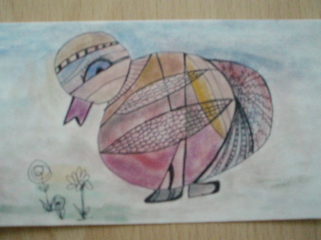
Picasso Dog
This is another exercise from Carla's book. I might have taken the instructions too seriously though. Here is my dog:

In my defense, your honor, I have to say that the background was already painted in dark colors and that determined the color choice after that. Oh, and there were some circles painted as well; I felt they had to be included in the final image, so my genetically engineered dog is all about roundness! It was a hilarious project and I am planning to try it again from scratch this time. These exercises have unpredictable results every time. That is what makes them so fun.

In my defense, your honor, I have to say that the background was already painted in dark colors and that determined the color choice after that. Oh, and there were some circles painted as well; I felt they had to be included in the final image, so my genetically engineered dog is all about roundness! It was a hilarious project and I am planning to try it again from scratch this time. These exercises have unpredictable results every time. That is what makes them so fun.
Thursday, August 19, 2010
Camus and Mary Oliver
What do they have in common?Nothing really ... other than the fact that they ended up on the same spread in my journal.
 It took a long time for this spread to come along. The left page had the little face stamped already, so I only colored the hair. Cleaning my art supplies, I found the postcard with the cowgirl and later I added the icon image in the middle. On the right page, I glued the small image at the botton (it is a small collage I did long time ago in a mini moleskine), then I added bits of grey papers and applied some red paint. I then spray painted through a stencil and wrote "Long life" by Mary Oliver with a dip pen and india ink. The pages still felt unfinished, so I added some doodling. I wrote some quotes by Camus on the left page and voila ...

Tuesday, August 17, 2010
Carving frenzy
I bought two more Big mistakes erasers and I started carving. I got so absorbed into it that I decided to cut the erasers and make even more stamps...fun!


Monday, August 16, 2010
Crusade nr 43 - Text messaging
I had no text to use for the page. I usually clip text for its meaning and not for the design value of the font. So I went on a pre-crusade hunting in the recycling. Then, I decided to use the grid layout from a previous crusade. I painted the background black and white, then glued the text and I ended up with this:

Not all the text "makes sense", but I guess some of it counts can count as "found poetry"...It was an interesting exercise, it got me to notice the design value of fonts. Now I have a designated envelope for font collection.
Thanks for visiting!

Not all the text "makes sense", but I guess some of it counts can count as "found poetry"...It was an interesting exercise, it got me to notice the design value of fonts. Now I have a designated envelope for font collection.
Thanks for visiting!
Sunday, August 15, 2010
Illustration Friday - Star Gazing
I have never participated in this project before and I was not planning to. It just happened. I noticed the topic pf the week - Star gazing. I had gessoed a small piece of cardboard and Icreated a bit of texture in the wet gesso by pressing some textured plastic. Then, I saw the two "friends" and I thought they would make a nice focal point for star gazing. I outlined the shapes in watercolor.

Then, I applied various layers of colored pencil, acrylic washes and pen. So here are the friends watching the stars together.


Then, I applied various layers of colored pencil, acrylic washes and pen. So here are the friends watching the stars together.

Saturday, August 14, 2010
Little girl
Time to give myself constraints. First, the size. I used my Derwent journal, which is smaller that what I normally use. On the left page, there are two sketches I made from images in a magazine. The girl is very small. I used a thicker brush. I wanted to see how the Adirondack inks behave on a smoother paper. I like the result, except for the hands. I was so stuck on the face I did not realized I chopped off her fingers ...I think it is too early to start "fighting" with the hands anyway!


Thursday, August 12, 2010
Blue Lady
Who says one has to use only "normal" skin tones to paint faces?! Nobody ...as you can see.
 I have to say I am pleased with the result. For the reddish tone, I used naphtol crimson from liquitex. Used alone, this color is so bright I cannot stand to look at it. I thought I will never used it, but in this combination I think it works well. For the background, I was not sure it I should go neutral. In the end I decided not to. I used scraps from my leftover pile and I think the orange balances the cool palette nicely. I added some colored pencil and pen doodles and voila ...

Playing around ...
... with templates. I got tired of the plain one, so I downloaded few freebies and gave them a try. For now, I choose this one. The others were nice, but they did not fit with the content of the blog for a reason or another.
I wanted something different, but not too busy or too "cute" (no ribbons, flowers, curlicues and such). I am not too sure about having three columns instead of two. The blog description is too long for the header too.
I am undecided between three templates, so I will be switching between them for few days. I would love to know what you think. Thank you!
For now, I will adjust the size of the pictures in the most recent post and keep it this way for a while...
Tuesday, August 10, 2010
Paint blobs
These sketches are on 4 x 5 cardstock. They started as paint blobs. I then gazed ...and gazed ...until I "saw" them...I think this is my favorite process...sometimes I want to do something else and I "see" something, then I don't have a choice anymore, I have to follow the lead see where it goes.


Monday, August 9, 2010
Inspiration is everywhere...
... including in sidewalk cracks, such as these:
 I decided to use the bottom image for an abstract composition. That was the plan ... what came out of it however is a different story:

I started with a piece of cardboard; I scraped some paint, then I transferred the lines from the sidewalk image...and I had "visions".Couldn't help it! I am not sure it is finished, I might add some words.
From the other images, I came up with these:
 These are on cardstock. The bottom right one is a surfing dolphin; the top left one is a mutant lobster - with only two legs. And the yellow one is a Miro wannabe. I think I will call it "The phantom director". I have a book about Miro's art and I am trying to channel him in my doodles. This exercise was from the Drawing Lab.
I am not sure what I will "make" with all these drawings, but I am having way too much fun to stop ...


I started with a piece of cardboard; I scraped some paint, then I transferred the lines from the sidewalk image...and I had "visions".Couldn't help it! I am not sure it is finished, I might add some words.
From the other images, I came up with these:

I am not sure what I will "make" with all these drawings, but I am having way too much fun to stop ...
Saturday, August 7, 2010
The Russian countess and the sailor
Once upon a time, there was an empty journal page. Careless handling of a paint tube resulted in a blob of titan buff in the middle of the left page. The blob was too lonely, and soon it was accompanied by another blob of green craft paint. Yellow and orange joined the dance; few pieces of napkins added to the drama. Here is the result:
 What do you see?
I see a woman on the left page. She wears a big Russian fur hat. On the right page, I see a sailor smoking cigar and two ghostly spirits. I outlined the shapes in pencil; hard to see a difference here.

What is their story I wonder ...

The green was too flat and lifeless, so I glued magazine papers over the hat. The bird was a photocopy, mostly black, and I painted it with interference colors. I applied a bit of hansa yellow over the face.
I colored the sailor with a mix on pan pastels and colored pencils. I wanted the ghostly spirits to be more in the background, so I applied a layer of mat gel and pan pastels. I stenciled a bird cage over the girl's face.
I should have taken more pictures in the process, but it was late and I forgot.
I was not sure what to do with the background, so I ended up doodling with white sharpie and adding more acrylic washes. I think there is something missing, but I am not sure what. The colors are a bit different in reality, but I cannot figure out how to take better picture. It is so frustrating, especially when I see other people's pictures.Now I have to write their story ...What do you think it is their story?
Friday, August 6, 2010
Chicken Little
Over at Carla's I saw those little creatures and I just had to try ... and I found Chicken Little "hidden" in pan pastels dust.

Wednesday, August 4, 2010
Drawing lab exercises
I started working my way through the exercises from Carla Sonheim's Drawing lab.
This spread has four exercises:
 The face at the top left started as a doodle on regular lined paper.
The drawing at the bottom left started with watercolor patches of color.
Right page top - can you tell? It's a monkey face.. but it looks more like a lion face.
The bottom right is a flower drew a la Liesel. The colors are deeper and I like that. I was pleased with the result, but the doodling part is not really my "thing". I have to find my "doodle vocabulary". I am not a swirlie-type person, more like a graffitti-geometrical type ... and I did not have light colored pens to write on top. I have lots of pens and they refuse to work, even the ones that do work for other people. I went out and bought few Sharpies extra fine they are great, but they do not come in too many colors. Besides this, it was a lot of fun!
This spread has four exercises:

The drawing at the bottom left started with watercolor patches of color.
Right page top - can you tell? It's a monkey face.. but it looks more like a lion face.
The bottom right is a flower drew a la Liesel. The colors are deeper and I like that. I was pleased with the result, but the doodling part is not really my "thing". I have to find my "doodle vocabulary". I am not a swirlie-type person, more like a graffitti-geometrical type ... and I did not have light colored pens to write on top. I have lots of pens and they refuse to work, even the ones that do work for other people. I went out and bought few Sharpies extra fine they are great, but they do not come in too many colors. Besides this, it was a lot of fun!
Monday, August 2, 2010
We want Miles
This past weekend, I realized the summer is almost over and I had yet to go on a trip downtown. Since my long run Saturday was actually short (only 20 km), I decided that this was an opportunity not to be missed. I spent the afternoon at the Museum of Fine Arts in company of Miles Davis - We want Miles can be seen until the end of the month. I enjoyed the exhibition - the music, the paintings (Basquiat, Klarwein, Miles). Of course, I could not resist and I bought three cds. And since any excuse is a good one when it comes to buying art supplies, I bought a Derwent journal to document the trip to the museum. The paper is good for ink and dry mediums and it is thick enough to allow for some collage. I did few quick drawings at the museum:

 Poor Jeanne Moreau though ... I quite disfigured her.This was the part I liked the most - the improvisation Miles did while watching Ascenseur pour l'echafaud. Amazing talent...
I wanted to take advantage of the trip and also try a life drawing session at Galerie Synestesie. Guess what ... I could not find the place! I have no idea what happened. I knew the address, I knew the area, I even saw the gallery few months ago walking in the area ... but this time, there was not sign of it. And that area is full of strip joints and such, so I did not feel like hanging around there for too long. And by that time, I was getting tired anyway so I decided to postpone this experience. And judging from the "quality" of my quick sketches, it might just have been a very good idea.


I wanted to take advantage of the trip and also try a life drawing session at Galerie Synestesie. Guess what ... I could not find the place! I have no idea what happened. I knew the address, I knew the area, I even saw the gallery few months ago walking in the area ... but this time, there was not sign of it. And that area is full of strip joints and such, so I did not feel like hanging around there for too long. And by that time, I was getting tired anyway so I decided to postpone this experience. And judging from the "quality" of my quick sketches, it might just have been a very good idea.
Subscribe to:
Posts (Atom)