
Sunday, April 27, 2014
On a grey day...
... needing some color, I decided to paint some flowers. Inspiration - a bad photo of a part of a bouquet. I picked some flowers I liked, but I forgot to pay attention to the composition until it was too late. I like how the lily turned out. Stenciled some shapes with pan pastels. Note to self: composition comes first!
I think I will play around some more with the original photo and try to come up with an abstract composition. It is evident that drawing realistic carnations is not my forte.
Saturday, April 26, 2014
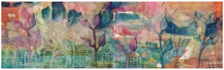
Tea and pepper
I used the proportional divider to measure the pepper mill, stained the page with a teabag and glued rose petals from my tea onto the plant stems.

Friday, April 25, 2014
Haut les mains
I have pre-painted some pages in the sketchbook using different paints. This page was primed with pan pastels. I sketched my hands with Pilot Penmanship.

Thursday, April 24, 2014
Colored pencils
Second week of Sketchbook skool - homework was sketching with colored pencils. I almost never use colored pencils, if not for adding some color when the watercolor washes are too pale. Here are the results of the experiment:


Wednesday, April 23, 2014
Charlotte
I used a photo from the newspaper as reference for this sketch - a french actress Charlotte is her name.
 Main problem - no resemblance. I am not looking for a perfect match I will never be a portraitist. I am looking for a specific quality of line and "look" of the sketches. Can't really define it better than this ... hopefully I will know it when I get there ...
Tuesday, April 22, 2014
Portrait Monday
The model was a young Chinese girl. We had three 20 minute poses and here are the results;
 First pose - pencil. The scanned image was too pale so I adjusted the contrast to make it pop more. Cute sketch, but does not look like the model at all.
Second pose - I tried using the proportional divider to measure the features.
 I don't like anything about this sketch. The charcoal used did nor blend, the measurements are off, the face is too long when in reality it was more round. The paper however is great (Strathmore tinted sketchbook 9 x 12).
Third pose:
 This is the only sketch that has some resemblance with the model.
At the end of the session, the model chose one sketch from each participant. In my case, she chose the second sketch...who knows why that one ?!
Second pose - I tried using the proportional divider to measure the features.
Third pose:
At the end of the session, the model chose one sketch from each participant. In my case, she chose the second sketch...who knows why that one ?!
Monday, April 21, 2014
Running shoes
Week one of Sketchbook Skool homework - dip pen over gouache prepainted background, I do not have gouache so I used pan pastels instead. Sketched my old running shoes - dip pen and Noodlers grey ink.

Wednesday, April 16, 2014
Life drawing
Another session at the Ecole de design. I was 30 min late this time - bad idea. I sat all the way in the back and I had a partially obstructed view of the model. People left at the break so I was able to get myself a table. I did few 3 min poses, followed by 5 min and few 10 min.


 Graphite on newsprint.
Tuesday, April 15, 2014
Portrait Monday
For this session, I wanted to play with layering portraits. The 3 min poses:


... and in general, with the neck. But all in all, I am happy with the results.
Monday, April 14, 2014
April Sketchcrawl
Montreal held the Sketchcrawl last Saturday. The official date is next Saturday, but that happens to be Easter weekend and most people take advantage of the long weekend to leave town or do other fun things.
We had excellent weather - yes!!! We found a nice vantage point inside UQAM and drew roofs.
At least I did.

A fellow sketcher - Ludmila -drew us:

We had excellent weather - yes!!! We found a nice vantage point inside UQAM and drew roofs.
At least I did.
A fellow sketcher - Ludmila -drew us:
Sunday, April 13, 2014
Collaged tulips
I have a 9x12 sketchbook I used for the dynamic drawing class. Most of the sketches of the tai chi master are not keepers, so I am reusing some of the pages. I applied collage pieces and absorbent ground. I then sketched a house - did not like the result. I applied another layer of absorbent ground, collaged a piece of Chinese print and drew tulips.
 I applied fixative between layers of paint because the watercolor lifts off the medium. I also applied metallic watercolors.
Saturday, April 12, 2014
Last of the tulips
... for a while at least.


Watercolor pencils and fountain pen,
Pentel pocket brush and pan pastels. I tried to work across the spiral, but did not succeed.
Friday, April 11, 2014
By the window

Thursday, April 10, 2014
Ducks in formation ...
... of sorts. These are actually geese, but who cares right?
Found them but the water in Lachine on Sunday. First attempt to sketch outdoors - the ink froze in the pen and I could not feel my fingers anymore. Sorry to say, but this ain't for me. I will go out when it is nice and toasty. Page was pre-painted with metallic watercolors.

Found them but the water in Lachine on Sunday. First attempt to sketch outdoors - the ink froze in the pen and I could not feel my fingers anymore. Sorry to say, but this ain't for me. I will go out when it is nice and toasty. Page was pre-painted with metallic watercolors.
Wednesday, April 9, 2014
Dynamic Drawing - the end
Last class was about feedback on homework and drawing plaster models.

 We talked a bit about curvilinear perspective - something I want to look into. The course if over, but the work is not. Of course ...
As somebody said - inspiration is for amateurs. The work needs to be done, no matter what. Show up and put in the hours. That is what I am trying to do...
As somebody said - inspiration is for amateurs. The work needs to be done, no matter what. Show up and put in the hours. That is what I am trying to do...
Tuesday, April 8, 2014
Dr Sketchy
Saturday was the monthly meeting for Dr Sketchy and my first time drawing a costumed model with the group. It was fun. Poses were from one min to 20 min. I used mostly the col-erase pencils - too light when scanned unfortunately. At home I added some pan pastels just for fun.


 I overlapped shorted poses or I would have used the whole sketchbook. The last poses where I think 5 min at the end of the session. I was tired and I decided to decapitate the model ...
Monday, April 7, 2014
Tulips
I've been wanting to buy some flowers to draw for quite a while. Few days ago, the grocery store had a special on tulips (sounds funny, I know). I decided that was it and I bought them.
I tried different papers and media and here are the results.
I drew too small - again! I don't know what's the deal now that I make everything too small. I did not add detail to the main bunch because everything was too cramped.
 Straight to watercolors - the result reminds me of something Marc said in the watercolor class - that the resulting painting is only as good as the base drawing. Agreed. There is definitely great appeal to doing things directly in watercolor, but that requires a much better drawing technique than what I have at the moment. I'd like to retry though and mix a diiffernt kind of greens and purples. The greens came out too yellow and the purples are dull.
 Here, I tried the new rogue journal that has handmade paper. Great paper, but it does not take media very well. No wet media, ink smears, some pens work ok. Pencil cannot be erased. Here I tried colored pencils, but the colors are way too pale.

I tried different papers and media and here are the results.
I drew too small - again! I don't know what's the deal now that I make everything too small. I did not add detail to the main bunch because everything was too cramped.
Saturday, April 5, 2014
Back to basics - 3
The topic for the third week was perspective. I chose a picture of St Joseph Oratory - it has enough building blocks to be challenging for me but it is not excessive to become overwhelming.
I tried stippling but I don;t have enough patience for this method. To work well, the dots have to be uniform, and they are not in my case. However, Earnest said that that other people used variations of the method such as dashes or thumb prints on bigger works. I might revisit the method and try a different mark making technique or size of dots.

The paper behaves as if there was a resist, something like a thumbprint. I did not do it on purpose - either the paper is like this or the quality is such that my fingerprints create the resist. I don't mind the efect - the more unpredictable the better. Next time I sketch a building I will go more fauvist. Nobody says building must be beige ...they can be any color ...
I tried stippling but I don;t have enough patience for this method. To work well, the dots have to be uniform, and they are not in my case. However, Earnest said that that other people used variations of the method such as dashes or thumb prints on bigger works. I might revisit the method and try a different mark making technique or size of dots.
The paper behaves as if there was a resist, something like a thumbprint. I did not do it on purpose - either the paper is like this or the quality is such that my fingerprints create the resist. I don't mind the efect - the more unpredictable the better. Next time I sketch a building I will go more fauvist. Nobody says building must be beige ...they can be any color ...
Thursday, April 3, 2014
Theatrical combat pose
Few weeks ago, Max organized a theatrical combat session for us to draw. Mostly gesture drawing - slow movement - and one longer pose at the end. I did not finish the long pose, so I tried again at home from the pics take in class. Col-erase pencils.

Wednesday, April 2, 2014
Burlesque
I discovered that there is a Dr Sketchy in Montreal! Lynne mentions it on her blog, but I figure it must be a British thing. It is not. It happens all over the place. As a warm-up for the next session on Saturday, I drew from some pics on the site.


 One thing is for sure - I never drew such nice legs!
I showed the sketchbook to Max for feedback and pointed out an interesting thing. I drew the first pose using the pocket brush, but I did not like the results. I drew again on top of the first drawing. I hated it. Moved on. But Max said that the "piled up" drawing looked as if she was moving - like in an old style animation. Also, the lines were more fluid. When going towards a more realistic approach, every mistake stands out. It sure does ... I think a reason why I don't like most of my drawings is that I do not know how to take them to the next stage or how to look at them from a different prospective. What is good a bout them? Can they suggest something else? What would somebody who does not know the story think when looking at it? I will have to remember to Max-ify all my drawings, especially the ones I don't like.
I used col-erase pencils, watercolor pencils and water-soluble ink
Subscribe to:
Posts (Atom)